This is going to be one in a series of posts, because I’ve got fun maps to share, and if I share them all at once, the post will be entirely tl;dr (if it isn’t already…)
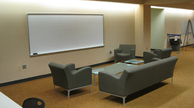
Atkins Library recently renovated our “basement,” that is, we took space that had been inhabited by staff doing the work of the library, gutted it (having found new places for our staff to work in), and turned it into an array of spaces in which students can do collaborative work. Here is what it looked like before there were people in it (photos by Cheryl Lansford, Interior Designer for UNC Charlotte):

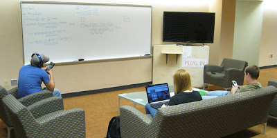
We have created configurable furniture arrangements in some areas, and more fixed arrangements in others. This picture shows the T1 touch screen tables (which also have screens at the head of the table, so students can plug in and share from their laptops.

This is a view into one of our new group study rooms, with tables that are wheeled as well as wheeled task chairs. Surfaces near the digital screens allow students to share from their laptops, and there is also a dedicated computer for them to work from if they do not have their own device with them. Whiteboards and the glass walls are meant to be written on (and are).

The space just outside of the library cafe has been set up to be more cafe-type seating, but with larger low tables, to accommodate the need to spread out with laptops, books, notebooks, and even more than one person’s “stuff” that they are working with. There are outlets in the wood-paneled pillars, to allow for student to plug in wherever they want to work.
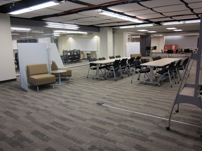
The most configurable part of the open space (that is, the space not contained in the study rooms), has more of the wheeled tables and task chairs, as well as some soft seating (relatively lightweight, so it can be moved around), rolling whiteboards, and movable privacy screens.
I think it’s all pretty cool. Our students seem pretty happy with it so far. We had a fancy grand opening for the space, and are grateful to all of the work that went into the design and building of it. Some of the work was done by me, and students under my supervision, in the form of studying the kinds of behaviors that go into collaborative work, and thinking experimentally about how to reveal the best configuration of space and technology to facilitate effective student learning.
In many learning space design scenarios, the opening is the ending. Universities continue to build new spaces, open them, and then walk away without thinking about what comes next. What did they get right about the new spaces? What did we get wrong? How can we improve it? When can we make changes?
I wonder sometimes if there is a fear of looking bad, somehow, if one goes in and makes changes to brand new spaces. As if the planning wasn’t good enough, and that’s why we need to change things so soon after the opening. I hope that is not the case, because we are already looking at the new spaces and thinking about things we need to change, to better respond to how people are actually using the space, rather than assuming that they are using the space as we imagined they would.
Sometimes, people just do their own thing.
To that end, I am enlisting the help of my graduate assistants this semester, Allison Schaefer (an MA student in Architecture), and Carrie Vass (an MA student in Communications), to systematically observe what is going on in our new spaces, and report back. At this early point in the semester (the spaces have only been officially open since January 23rd), we already have several days’ worth of observations, and some nice visualizations of that observation data. We are interested not just in how people are using the spaces and the furniture
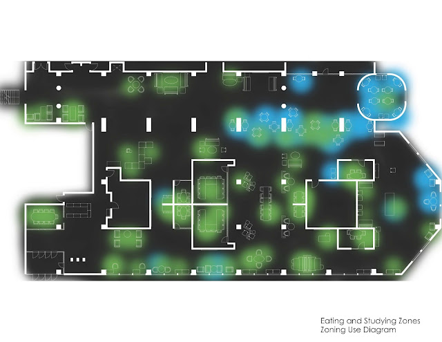
Allison created maps of our ground floor using Revit, and then added color for movement or activity using Adobe Photoshop and Illustrator. She mapped the kinds of activities people were doing, and also where people walked when they moved through the space, over the course of her observations. First up: the activity maps.
 |
| This shows where people were eating in the course of her observations (about 8 hours altogether). The heavily blue areas are adjacent to the library cafe. But eating is clearly happening near the nice windows overlooking the Student Activity center (on the right, in this diagram), and in the central parts of the spaces. |
 |
| This is where studying is happening in the new space. All over. |
 |
| This is where talking in happening in the space. Also, all over. |
 |
| When we overlap the maps for eating and studying, we see that they are not mutually exclusive areas. These maps were created from afternoon observations–if they included evening hours, we know that there would be even more overlap. Atkins library has allowed food and drink in its spaces (except in Special Collections) for several years, now, and this shows that we are right to not treat these activities (eating and studying) as mutually exclusive. |
 |
| Can you study and talk at the same time? Our students can and do. While some areas clearly show one thing or the other happening, the overlap is significant. |
 |
| Just because students have a laptop open does not mean they are studying. Likewise, just because they don’t have a laptop, doesn’t mean they are not studying. |
These maps are beautiful and informative, and of course are only part of the picture. Next post, I will talk about the maps Allison created that show how the density of occupation varies, as well as length of stay, and the maps that show circulation patterns through the space. I will also have pictures of what the spaces look like when they are occupied!


