Last time I blogged on some of the work my current architecture student, Allison Schaefer, is doing in the new ground floor spaces of Atkins Library. This time you are going to hear from Mitch McGregor, whom I advised last year during his MA (architecture) thesis research. Mitch did his work in our ground floor before it was reconstructed, and the work he did helped inform decisions we made about furniture and technology in our new student spaces. All of Mitch’s work was covered by the Atkins Library Ethnography IRB Protocol.
**************************
I wanted to find a way to design a space based on research of what inhabitants really expected from the space. I chose the Atkins Library due to the amount of people that use its spaces, and the variety of activities done there. My intent was to observe the activities that were taking place, and to try to understand why certain group spaces that had been tried in the library were not being very successful. What was causing these spaces that were equipped with new useful technology to be overlooked?
After observations and a few low technology experiments in different parts of the library, I decided to find a specific space that would be more conducive for group dynamics. I chose the corridor on the Atkins ground floor connecting the main stair and the coffee shop as the area of study.
 |
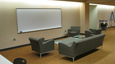
| Part of the ground floor in Atkins Library, Spring 2012. |
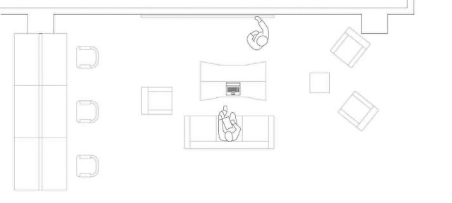
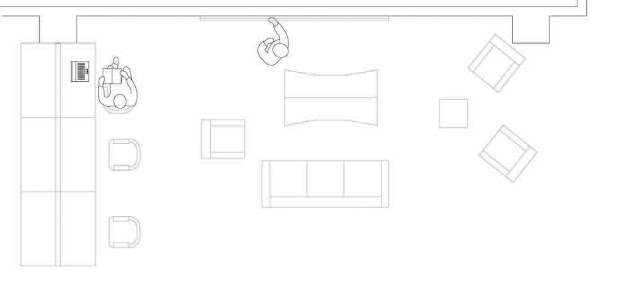
This space had areas that allowed both private and group work mainly due to the type of furniture and arrangement of it. I observed that people wanting to be alone would come and sit at the long tables between each “bay” with a whiteboard, couch, coffee table, and soft chairs. This “living room” arrangement of furniture facing white boards promoted group use of the space. The space was adjacent to a busy travel corridor, and people working there seemed comfortable communicating aloud to group members. During my observations, I sketched diagrams to analyze the types of activities that were happening in this space. Here are some examples of the cleaned-up drawings (created in Adobe Illustrator):
 |
| The long table that tended to attract students studying alone is on the left. The “living room” arrangement is in the center, comprised of a couch, chairs, and coffee and end-tables. In this sketch, 2 students are working at the whiteboard, and using the coffee table to hold the laptop and textbook they are consulting for their studies. |
 |
| Here one student is taking notes on the couch, referring to material on the laptop, while the other sketches out thoughts on the whiteboard. |
 |
| The student at the long table is referring to a textbook and laptop while the other uses the whiteboard to think through the reference materials. |
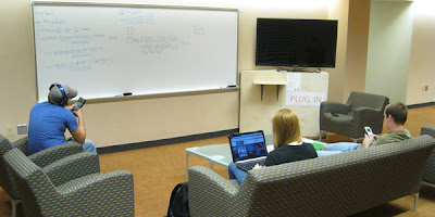
My goal was to understand what people were already coming to this space to do. Rather than recreate the space with a new type of activity in mind, I wanted to think about redesigning the space to enhance the current use. I observed the space for about 12 hours, and found that I groups were coming to this space for a few main reasons. One was that groups would come to the space to work on problems or brainstorm, often using the whiteboard while referring to a book or laptop. This often became difficult because there was no place to put books or laptops that was adjacent to the white board. Other groups used the space to work on group presentations, by sitting in the couch area and working from one or multiple laptops, discussing a group project. I then derived scenarios for additional activities that could happen in this space if certain amenities were added. I thought the space could benefit from a large screen adjacent to the whiteboard that students could hook up their laptops to. To allow for multiple uses, I decided the screen should be able to be connected to while near the whiteboard, as well from sitting in the sitting area facing the screen. I chose this arrangement:

In one week I spent about 56 hours observing this space, varying my time of observations from early morning to after midnight. I observed the screen station was used for every thing from a cell phone charging station , to practicing power point presentations, to solving physics equations. The first few days proved to be difficult, because some things that I as the designer took for granted were not obvious to new users. For example, I thought it would be obvious how to plug into the screen, but ended up having to make the cords far more obvious than “sleek” designs would allow for.
As I worked through these issues and tried to make the installation more user friendly, I also conducted several interviews. I asked users of different varieties what they liked and disliked about the space and what could be improved. Most students said they really liked how they could move things around in the space, such as the furniture or where they connected to the screen. The space met their basic needs, yet was manipulable to specific groups’ needs. The more flexible spaces can be the more apt people are to use them.


This process showed that with research into what a space is currently used for, and how those current uses can be enhanced proves much more efficient than just creating a space and intending for specific activities to take place there. Students wanted a semi-private space that they could adapt to various types of group work. The possibility of multiple types of media showing information at the same time, in this case, whiteboard and media screen, allows the group to function even more efficiently. Students also want this technology to be easy to use; if the technology in this space takes too much of a learning curve it is possible that students will avoid it. Overall, a research-based process allows designers and educators to greatly increase the success and efficiency of a space.
Looking at the
new spaces now, a year since the original research started, it is great to see how the new spaces have implemented some of the discoveries of the research. The new spaces that have both white boards and media screens where students can connect allow for the group collaboration and efficiency. The type of furniture and dividers being used also give the students power over the space they are working in.
**************************************************
I would add to what Mitch has written here that while his research was just part of the information we compiled and responded to in thinking about and designing the new ground floor, it was a crucial part. Because it was grounded in the actual behavior of our students, we could use this work to think through ahead of time the details that demanded our attention.
_______________
McGregor, Mitchell L. Principles of Space and Interaction (unpublished M.A. thesis) Department of Architecture, University of North Carolina, Charlotte, NC.


