Tag Archives: furniture

London Travelogue, Part the Third: Senate House

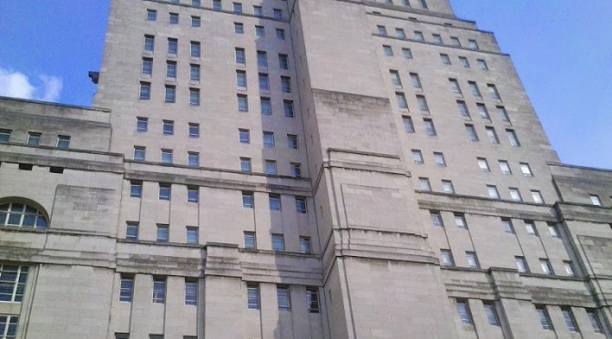
Thanks to Andrew Praeter and Simon Barron I got a fantastic tour of the Senate House library (and building) just before I left London for home.

It’s a spectacular building–apparently, if WWII hadn’t broken out, it would have been part of a complex that extended all the way up through Gordon Square (right in front of the current Institute of Archaeology building).  Crazy to think about.  It was the first skyscraper in London.

It’s a landmark in Bloomsbury, and I’ve been walking past it for years, never quite realizing that’s what it was.  Senate House is an interesting library in that it’s not attached to any one particular University, but rather has (someone correct me if I’m wrong) member institutions who pay for their students to have access.  Senate House showed up in some of the cognitive maps that I collected from people at UCL, as a place where people enjoyed working.  It’s a lovely building, I adore Art Deco architecture and design, and it’s a pleasure walking around it.  The specific history of the building is fascinating, as there are elements that are simply unfinished (especially decorative flourishes that never happened), because of the War.  The decorative flourishes that did manage to happen are stunning.

Stained glass windows.

The Senate Chamber.  I want to give a talk in this room SO MUCH.

More stained glass.

Beautiful clock (with the reflection of Simon for good measure).

Lovely fabulous marble hall.

The library-specific spaces in Senate House are uniformly Traditional Quiet Library spaces–there are no group study spaces in Senate House (although, apparently, students will walk up to the desk and ask “where are the group study rooms?”).  The assumption is that there are such spaces provided by the home academic departments.  I wonder how accurate that assumption is.

At any rate, as Traditional Library Spaces go, the ones in Senate House are nicely appointed, and are a good fit with contemporary scholarly behaviors (and technology).

This traditional reading room has tables big enough for people to spread out, and also use their laptops/tablets
This reading room used to have desktop computers in it, but they moved those out and now just have large tables as shown.

Self-service laptop checkouts have replaced desktop computers distributed throughout the Senate House spaces. Patrons can take the laptops wherever in Senate House they feel most comfortable working, and don’t have to rely on where computers happen to be, if they don’t walk in with their own devices.  Wireless is throughout the building.
Up in the stacks, there are workspaces as well.  These little window seats have always been popular (windows are popular in Atkins, and really in nearly every library I’ve ever seen, at least in terms of where patrons like to park themselves).  Senate House recently got new fittings for these window areas.
A light, a shelf, a work surface, and outlets/powerpoints.  And, a chair.
There are also these tables, with powerpoints and room to spread out.  The funny pillars on the end of the table are artifacts from when there was a fixed desktop and monitor on one end of the table.  Senate House has moved away from desktops in their library, except where they are used for catalog check stations.
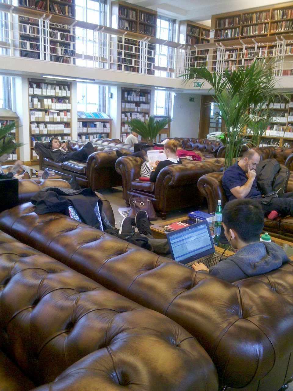
This, however, is my favorite space in Senate House.  Filled with huge tufted leather sofas.  Magic.
Apparently there was some initial worry that the sofas would encourage talking.  I think that the arrangement of them in rows, the fact that they are massive heavy pieces, and the placement of them in a room that is clearly a “Traditional Reading Room” all sets the tone nicely, and it’s clearly a quiet place to study that just happens to be filled with soft seating rather than desks and hard chairs.  I would spend all of my time here, if this were My Library.

Field Trip! NC State Hunt Library and Spaces to Think With.

On Wednesday I visited not just NC State for the first time ever, but I got to have a comprehensive tour of the new James B. Hunt Library.  They had an open house yesterday, and the place was full of people who work in libraries (visitors came from all over the region, including out of state) being led around the amazing spaces.

There are pictures of the Hunt library all over the internet–I reproduce mine here not because they are fantastic photos, but because I took pictures of things that help me think about library spaces, and about what is possible in our own spaces at Atkins (which I’ve been uncharacteristically (for my blog) chatty about  recently).  It is an objectively spectacular space, and the fact that not everyone has the resources to create such a space should not deter people from going into what NCSU has created, learning from it, and dreaming big.   I intend here (and everywhere) not just to think about spaces, but to think with spaces, not just fancy ones like there are at Hunt, but in the more mundane everyday spaces in which our students and faculty find themselves.

The small 3-D printer that NCSU students
can use for prototypes for classes, or just having fun.

I am going to blog here mostly about space, although the tech stuff possible in the Hunt library is just as cool, and just as worthy of anyone’s attention; for example, the fact that students and faculty now have 3-D printers at their disposal in the Hunt makerspaces. 


The Hunt library is, to my mind, the biggest branch library I have ever seen.  It is the library for the new Centennial Campus at State, which means its primary users are in Engineering, Textiles, and other science programs.  It is also envisioned as a “second main library” for the entire university, and I will be interested to see what other constituencies use the spaces in that building.  They are undeniably attractive.

Color has been used in simple but effective ways to mark places that students need to look for.

Yellow is for Stairs.

Blue is for Elevators.

                                                                                             Orange is for restrooms.

Red is for Asking for Help (as well as the Wolfpack).
 

All people going into and out of the library have to pass by the Ask Us station, which is not just an info point, but an all-services point, where students can go to for reference, technical, and circulation help.  In addition, workers can be deployed (via walkie talkie) to parts of the library where people need help (this is apparently very popular for IT type help).  Reference specialists can be called from other parts of the building if a question is particularly in-depth.  Books that are retrieved by the “Book Bot” are put in this space within five minutes of the request.

And hey, let’s talk about that Book Bot.

Entering on the 1st floor of the Hunt Library gives you a great view of the “back” of the automated vertical storage unit, which holds 1.5 million volumes.  Books, folios, microfilm, and DVDs (among other things) once requested, can be made available for patrons in 5 minutes (and retrieved from the Ask Us station), or delivered to faculty offices.  They are sorted by size, and bar-coded for identification (although they are also RFID-ing each thing that is circulated, with the hope that at least the most circulated things will be RFID-tagged eventually, if not the entire Hunt collection). 

This is the “front” of the system, showing one of the robots that retrieves the books, with one of the bins, showing how the books are sorted. 

So, yeah, the system is cool, and really makes me think about the future of stacks maintenance, but what I was struck by was what NCSU’s library IT has built to make it possible to browse closed shelving (it’s currently in Beta).

They call it Virtual Browse, and it’s a touch screen that is currently mounted on the 1st floor, before you enter the library proper, between the large windows that give you a view onto the back of the Book Bot. 

This allows for browsing the Hunt collection in a way that is simply not physically possible anymore, given that the books are all in the automated storage system, and that it was never possible to look at the physical collection and browse the electronic resources at the same time.  The Virtual Browse includes electronic resources as well as physical.  This exercise in stacks virtualization, I think, is not just useful for libraries with closed/automated/off-site collections, but for all of us.  In my experience, many of our patrons experience our stacks as “closed” even if they are technically open, because they don’t know how to navigate or read the stacks.  This tool allows them to navigate the stacks and find things even if they don’t understand the call number system, even if they aren’t exactly sure where in the building those books are.   I think I’m more excited about the virtual browser than I am about the book-finding robot.

The collaborative work spaces in open parts of the Hunt library (spread across 3 floors) are colorful and configured in a variety of ways (with very attractive and fancy furniture). 

                                                                                                                                                                         Some booths.  This one has a view beyond to the Graduate Reading Room.

Some tables with task chairs, rolling whiteboards, stools.

Some bar-type computer banks.

 (the computers were Coming Soon).


And so on.

There are also spaces that evoke the design trope of the reading room, also spread across at least 3 floors of the Hunt Library.

 
I especially appreciated the simple trick of integrating physical books into spaces for effect.  The silent study reading room at one end of the main floor is lined on at least two sides with book shelving.


The rain garden reading room just before that integrates some of the reference collection, faculty book collection, and new books into the furniture arrangements.


What books do here is set expectations, they read “library” to people, and they say, without any signs of any kind , volumes (ha) about where people are once they walk into those spaces.  When we start downsizing our physical collections, I think we who work in libraries would do well to think about the other properties of books– to think carefully about all the different ways that books speak to our communities, beyond the delivery of content.

And here’s the thing:  we don’t have to have all the resources in the world to engage in the kind of thinking that NCSU put into its Hunt Library spaces.  I think (to be utterly immodest) that we are trying to do that kind of thing in Atkins at UNCC, right now.  Every library should aspire to be:  clear about what is where, beautiful in its execution of design, deliberate in providing a variety of spaces, and thoughtful about how and where to deploy appropriate technology, and dedicated to the staffing levels that create seamless access to services and resources.  We need to think with the spaces we already have, pay attention to what is trying to be done in those spaces, and imagine beyond what is there now to what could be.

Guest Blog: Mitchell L. McGregor on groupwork, observing spaces, and the Prequel to our new spaces

Last time I blogged on some of the work my current architecture student, Allison Schaefer, is doing in the new ground floor spaces of Atkins Library.  This time you are going to hear from Mitch McGregor, whom I advised last year during his MA (architecture) thesis research.  Mitch did his work in our ground floor before it was reconstructed, and the work he did helped inform decisions we made about furniture and technology in our new student spaces.  All of Mitch’s work was covered by the Atkins Library Ethnography IRB Protocol.

**************************

I wanted to find a way to design a space based on research of what inhabitants really expected from the space. I chose the Atkins Library due to the amount of people that use its spaces,  and the variety of activities done there. My intent was to observe the activities that were taking place, and to try to understand why certain group spaces that had been tried in the library were not being very successful. What was causing these spaces that were equipped with new useful technology to be overlooked?
After observations and a few low technology experiments in different parts of the library, I decided to find a specific space that would be more conducive for group dynamics.  I chose the corridor on the Atkins ground floor connecting the main stair and the coffee shop as the area of study.

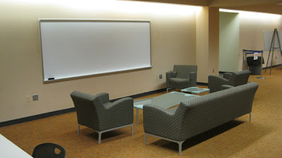
Part of the ground floor in Atkins Library, Spring 2012.
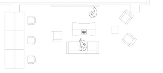
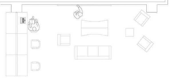
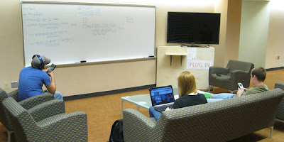
This space had areas that allowed both private and group work mainly due to the type of furniture and arrangement of it. I observed that people wanting to be alone would come and sit at the long tables between each “bay” with a whiteboard, couch, coffee table, and soft chairs.  This “living room” arrangement of furniture facing white boards promoted group use of the space. The space was adjacent to a busy travel corridor, and people working there seemed comfortable communicating aloud to group members. During my observations, I sketched diagrams to analyze the types of activities that were happening in this space.  Here are some examples of the cleaned-up drawings (created in Adobe Illustrator): 
The long table that tended to attract students studying alone is on the left.  The “living room” arrangement is in the center, comprised of a couch, chairs, and coffee and end-tables.  In this sketch, 2 students are working at the whiteboard, and using the coffee table to hold the laptop and textbook they are consulting for their studies.

Here one student is taking notes on the couch, referring to material on the laptop, while the other sketches out thoughts on the whiteboard.

The student at the long table is referring to a textbook and laptop while the other uses the whiteboard to think through the reference materials.
My goal was to understand what people were already coming to this space to do. Rather than recreate the space with a new type of activity in mind, I wanted to think about redesigning the space to enhance the current use. I observed the space for about 12 hours, and found that I groups were coming to this space for a few main reasons. One was that groups would come to the space to work on problems or brainstorm, often using the whiteboard while referring to a book or laptop.  This often became difficult because there was no place to put books or laptops that was adjacent to the white board. Other groups used the space to work on group presentations, by sitting in the couch area and working from one or multiple laptops, discussing a group project.  I then derived scenarios for additional activities that could happen in this space if certain amenities were added.  I thought the space could benefit from a large screen adjacent to the whiteboard that students could hook up their laptops to. To allow for multiple uses, I decided the screen should be able to be connected to while near the whiteboard, as well from sitting in the sitting area facing the screen. I chose this arrangement:
  
 In one week I spent about 56 hours observing this space, varying my time of observations from early morning to after midnight. I observed the screen station was used for every thing from a cell phone charging station , to practicing power point presentations, to solving physics equations.  The first few days proved to be difficult, because some things that I as the designer took for granted were not obvious to new users. For example, I thought it would be obvious how to plug into the screen, but ended up having to make the cords far more obvious than “sleek” designs would allow for.  
As I worked through these issues and tried to make the installation more user friendly, I also conducted several interviews. I asked users of different varieties what they liked and disliked about the space and what could be improved. Most students said they really liked how they could move things around in the space, such as the furniture or where they connected to the screen. The space met their basic needs, yet was manipulable to specific groups’ needs.  The more flexible spaces can be the more apt people are to use them. 


This process showed that with research into what a space is currently used for, and how those current uses can be enhanced proves much more efficient than just creating a space and intending for specific activities to take place there. Students wanted a semi-private space that they could adapt to various types of group work. The possibility of multiple types of media showing information at the same time, in this case, whiteboard and media screen, allows the group to function even more efficiently. Students also want this technology to be easy to use; if the technology in this space takes too much of a learning curve it is possible that students will avoid it. Overall, a research-based process allows designers and educators to greatly increase the success and efficiency of a space.
Looking at the new spaces now, a year since the original research started, it is great to see how the new spaces have implemented some of the discoveries of the research. The new spaces that have both white boards and media screens where students can connect allow for the group collaboration and efficiency.  The type of furniture and dividers being used also give the students power over the space they are working in. 
**************************************************
I would add to what Mitch has written here that while his research was just part of the information we compiled and responded to in thinking about and designing the new ground floor, it was a crucial part.  Because it was grounded in the actual behavior of our students, we could use this work to think through ahead of time the details that demanded our attention.

_______________

McGregor, Mitchell L.  Principles of Space and Interaction (unpublished M.A. thesis) Department of Architecture, University of North Carolina, Charlotte, NC.

New Learning Spaces and the role of Ongoing Research

This is going to be one in a series of posts, because I’ve got fun maps to share, and if I share them all at once, the post will be entirely tl;dr (if it isn’t already…)

Atkins Library recently renovated our “basement,” that is, we took space that had been inhabited by staff doing the work of the library, gutted it (having found new places for our staff to work in), and turned it into  an array of spaces in which students can do collaborative work.  Here is what it looked like before there were people in it (photos by Cheryl Lansford, Interior Designer for UNC Charlotte):


We have created configurable furniture arrangements in some areas, and more fixed arrangements in others.  This picture shows the T1 touch screen tables (which also have screens at the head of the table, so students can plug in and share from their laptops. 
This is a view into one of our new group study rooms, with tables that are wheeled as well as wheeled task chairs.  Surfaces near the digital screens allow students to share from their laptops, and there is also a dedicated computer for them to work from if they do not have their own device with them.  Whiteboards and the glass walls are meant to be written on (and are).
The space just outside of the library cafe has been set up to be more cafe-type seating, but with larger low tables, to accommodate the need to spread out with laptops, books, notebooks, and even more than one person’s “stuff” that they are working with.  There are outlets in the wood-paneled pillars, to allow for student to plug in wherever they want to work.
The most configurable part of the open space (that is, the space not contained in the study rooms), has more of the wheeled tables and task chairs, as well as some soft seating (relatively lightweight, so it can be moved around), rolling whiteboards, and movable privacy screens.  

I think it’s all pretty cool.  Our students seem pretty happy with it so far.  We had a fancy grand opening for the space, and are grateful to all of the work that went into the design and building of it.  Some of the work was done by me, and students under my supervision, in the form of studying the kinds of behaviors that go into collaborative work, and thinking experimentally about how to reveal the best configuration of space and technology to facilitate effective student learning.

In many learning space design scenarios, the opening is the ending.  Universities continue to build new spaces, open them, and then walk away without thinking about what comes next.  What did they get right about the new spaces?  What did we get wrong?  How can we improve it?  When can we make changes?

I wonder sometimes if there is a fear of looking bad, somehow, if one goes in and makes changes to brand new spaces.  As if the planning wasn’t good enough, and that’s why we need to change things so soon after the opening.  I hope that is not the case, because we are already looking at the new spaces and thinking about things we need to change, to better respond to how people are actually using the space, rather than assuming that they are using the space as we imagined they would.

Sometimes, people just do their own thing.

To that end, I am enlisting the help of my graduate assistants this semester, Allison Schaefer (an MA student in Architecture), and Carrie Vass (an MA student in Communications), to systematically observe what is going on in our new spaces, and report back.  At this early point in the semester (the spaces have only been officially open since January 23rd), we already have several days’ worth of observations, and some nice visualizations of that observation data.  We are interested not just in how people are using the spaces and the furniture

Allison created maps of our ground floor using Revit, and then added color for movement or activity using Adobe Photoshop and Illustrator.  She mapped the kinds of activities people were doing, and also where people walked when they moved through the space, over the course of her observations.  First up:  the activity maps.

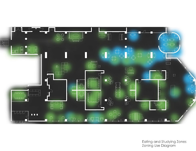
This shows where people were eating in the course of her observations (about 8 hours altogether).  The heavily blue areas are adjacent to the library cafe.  But eating is clearly happening near the nice windows overlooking the Student Activity center (on the right, in this diagram), and in the central parts of the spaces.

This is where studying is happening in the new space.  All over.

This is where talking in happening in the space.  Also, all over.

When we overlap the maps for eating and studying, we see that they are not mutually exclusive areas.  These maps were created from afternoon observations–if they included evening hours, we know that there would be even more overlap.  Atkins library has allowed food and drink in its spaces (except in Special Collections) for several years, now, and this shows that we are right to not treat these activities (eating and studying) as mutually exclusive.

Can you study and talk at the same time?  Our students can and do.  While some areas clearly show one thing or the other happening, the overlap is significant.

Just because students have a laptop open does not mean they are studying.  Likewise, just because they don’t have a laptop, doesn’t mean they are not studying.

These maps are beautiful and informative, and of course are only part of the picture.  Next post, I will talk about the maps Allison created that show how the density of occupation varies, as well as length of stay, and the maps that show circulation patterns through the space.  I will also have pictures of what the spaces look like when they are occupied!

Space Hacking and Student Engagement

Outside learning spaces at UNC Charlotte.

So I went to THATCamp Piedmont in Davidson, NC in early May, and attended  Mark Sample’s Spacehacking panel.  The panel was full of faculty whose concerns were largely classroom based, and whose desires seemed to centered around how to shake things up physically in classrooms, so students are engaged, while at the same time meeting expectations that materials are presented by professor to students.  We brainstormed about furniture, digital tools, sitting and standing, taking the professor out of the front of the room (and the pedagogical challenges therein), expressed concerns about accessibility, and speculated about non-classroom-based work environments (like, the great outdoors!).

Calling something like a classroom a “learning space” implies that they are also “teaching spaces”–the direction of that teaching has traditionally been from professor to student, but increasingly we are asking students to teach each other, and occasionally to teach us about the materials we wish them to be engaged with.  Classrooms in university environments are frequently locked into particular configurations, especially the auditorium-style rooms with bolted-down chairs, immovable tables, and a very fixed focal point at the front of the room.  The room we were in during the panel (in the Center for Teaching and Learning in the E.H. Little Library at Davidson College) was very configurable, with desk-height tables on wheels, comfortable task chairs, and whiteboards along the entire perimeter of the room.  It still had a smart podium at one end of the room, requiring whoever was needing to present materials to treat that side of the room as the “front” (there was also a smartboard there).  It was also, apparently, not a terribly typical learning space at Davidson (though it was a very in-demand space!).

During the panel and after I was thinking about Atkins library spaces, and the changes we’ve already made that have resulted in big differences in student engagement in learning spaces.  For example, my colleague Heather McCullough, the head of our Digital Scholarship Lab, came across a group of students studying in our ground floor collaborative spaces during finals week.  There was one student at a whiteboard, outlining principles of Economics, being listened to by a group of his classmates.  The student’s classmates asked him,”how do you know this stuff??” He told them, “I did the practice problems in the back of the textbook.” And his classmates said, “Can you tell us how to do that?”  And so he did.  They were not doing this in a classroom, they were doing this in the library, sitting on couches and comfortable chairs, facing a whiteboard, feet up on the glass coffee table they were circled around.
Students teaching each other during finals week 2012

Now, faculty can choose to despair at the image of students at the end of the semester just figuring out the utility of the practice problems in the back of the textbook.  Or, they can choose (as I do) to be struck by the tableau of students teaching students not just the course material, but techniques for success in class, techniques that they can then take out of the current class they are enrolled in and apply to future situations.  Student engagement is happening in the library–they are engaged with their course materials, they are engaged with each other (and not just in a social way), they are engaged with the stuff of intellectual work, one of the most important reasons for them to come to university.

These students stacked tables to make the furniture work better for them

 If such engagement is not happening regularly in the classroom, or, if the kinds of engagement that faculty are experiencing in classrooms are not satisfying (either to faculty or to students), then how can we bring the engagement we see happening in the library into other parts of campus?  Could one part of the solution be a reconfiguration of space?

I’ve been trying to think about space in the library here at UNCC in terms of a concepts I’ve borrowed from my colleagues:   in environmental psychology, “behavior settings”, from architecture, “affordances,” and from my own field, anthropology, the idea of “places” as cultural constructs.  “Behavior settings” refer to the cluster of assumptions that particular environments suggest to people upon entering the space (think of those velvet ropes that lead up to service desks–we know we’re being set up to wait in line).   “Affordance” is a related concept (also used by people in Human-Computer Interaction), describing the range of possible activities/functions suggested by a particular space/piece of furniture/object.  For example, a chair suggests a limited range of options (sitting), where a staircase wide enough to accommodate seating as well as walking (as in this example at the Sanford School of Public Policy at Duke) can suggest a larger set of possibilities (sitting, walking, meeting, talking, etc).   Anthropologists approach “place” as the set of cultural meanings that are imposed by people onto physical spaces.  I think it’s useful to keep all three of these concepts in mind when contemplating creating spaces that meet the needs of both students and their instructors, at universities and elsewhere.

With our reconfiguration of our ground floor spaces (and I swear, we’re going to start reconfiguring other spaces as soon as we have the resources to do so!), we have been consistently paying attention to what students were trying to do, both on the ground floor as well as in other parts of the library.  We saw them trying to work in pairs or threes at traditional library carrels, we saw how overbooked our group study rooms were, we saw the syllabi requiring that students work in groups as a part of their coursework.  Those observations helped inform the decisions we made to dedicate most of the ground floor to collaborative work spaces.

In the same vein, paying attention to what faculty are trying to do when they are teaching should inform classroom design.  Faculty are already (as evidenced by the roomful of concerned professionals at THATCamp Piedmont) thinking about novel ways to reach their students in the classroom.  They should be partners with classroom support and facilities departments on campuses in planning classroom spaces, and experimenting with operationalizing those ideas with the help of different furniture, digital tools, and open minds.  I know that some faculty (I’m thinking of @georgeonline here) are already doing this at their respective institutions.

What’s happening on your campus to transform learning and teaching spaces?  What works and what doesn’t?

Beautiful University Libraries and Thinking about Space

So, this lovely series of photos from stumbleupon shows a lot of university library reading rooms, primarily from old, historic libraries such as reading rooms at Oxford, UK, or in historic American universities such as Harvard, or UC Berkeley.

I’m struck by how few people there are in these photographs.  I understand that the photographer was probably more focused on the beauty of the spaces, but it seems to me that the true beauty of a library is in what the space provides in terms of the potential for people to think and work. So, yes, some of these lovely spaces do that.  But we can’t see that in action in these spaces.

We are getting new spaces in Atkins, and I’m curious to see how they facilitate student work on campus, and what kind of work ends up being done.  The new north entrance to Atkins will be more than just a new doorway, there will be a large group study/conference room, and open spaces designed for collaborative work as well.

We’ve got spaces on the ground floor that have experimental furniture in them, and it’s still unclear if students are using the furniture (like this mediascape table) in the way it’s intended.

There are also spaces on the 1st and 2nd floors in particular that are still relatively unconfigured–we haven’t really decided what we want to put in there long-term, so students are arranging those spaces themselves.  I am going to be starting the New Year trying to investigate what students want out of these open spaces–what kinds of things are they trying to do, what kinds of things are they successful in doing, and what informs that success?

Finals are nearly over–where are you doing your best work in the Library?  What do you wish these new spaces to do for you?

Macs! And other Computer things

So, we’re working on adding about 35 more computers to the total in Atkins Library–10 of them will be Macs.

We are limited, right now, in where to put them, because of the limits on where ethernet connections are.

But, working within those limits, we might have some flexibility. Here is where we could use a little more information.

What kind of furniture do you like best, when you have to sit and work on a desktop computer? And be specific about what kind of work you are doing when you are at the desktop. Do you like the big tables? The carrels? The circle-pod thingys on the first floor? What about the furniture makes your work easier or harder to do?

Are you doing work in groups? How does your group use the desktop?

And if you have a laptop, what kind of furniture makes it easier to do the kind of work you need to do for your classes?

Quiet, or not Quiet

The Quiet/Not Quiet Troubles plague University libraries worldwide, I think. It is, at the very least, an intense problem locally, here at UNCC. It seems to me that there are legitimate work-based reasons why people want to be noisy (well, reasonably so) in the library. Think of: group work, studying in pairs. And there are time-honored and important reasons to need quiet in the library.

And so, we have group study rooms. Noise contained in a room, people outside the room are happy in their quiet. But, what about when those are full? What then?

Is the first floor really ever going to be a quiet space? Is it reasonable to expect it to be? Should we continue to spit in the wind, putting furniture on the first floor, high-traffic areas, that signal “quiet study here?”

What if much of the first floor was an open space with places for both group and individual study, but with very little expectations that the space be “library quiet?”

Where, then, should the quiet spaces be?